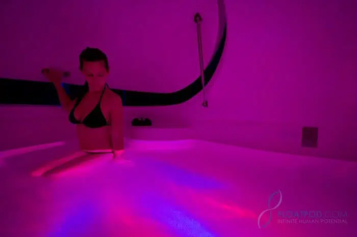
Customization: That’s the theme that winds through every aspect of a True REST floating experience. Each True REST Float Pod is developed with the understanding that no two sessions are exactly the same.
The lighting installed in each pod is no exception – users can individualize each float by basking in a preferred colored light, or cycling through a calming rainbow of options without interrupting the session. Particularly for followers of chromotherapy, personal control can be vital to maximize their practice.
But for every chromotherapy practitioner, many more spa-goers walk in to float without a basic understanding of how light can enhance their session.
Traditional chromotherapists utilize light to balance the body’s energy. Depending on the practitioner, they may prescribe exposure to different hues in an effort to improve physical, emotional, spiritual, or psychological ailments.
While chromotherapy as a medical practice isn’t widely accepted, there’s no doubt that exposure to various colors impacts our mood, attitude, and outlook. Designers, artists, and even marketing professionals employ color strategies to tap into our emotions, evoke memories, or inspire action. By understanding the traditional and social connotations surrounding color, you can optimize each float using chromotherapy.
Red & Orange: In some Eastern traditions, red and orange signal spiritual grounding, instinct, and gut emotions. Even in modern society, we associate these warmer colors with action; red is stimulating and social, often utilized in restaurants to whet our appetites and encourage conversation.
Yellow: Like its warm counterparts, yellow evokes energy. Traditionally associated with power or ego, yellow hues can elicit feelings of openness and stoke creativity. Others may feel at ease, correlating yellow with happiness or prompting memories of basking in the sunlight on a summer day.
Green: Green is the color of concentration, revitalization, and relaxation. Some research suggests that strong associations with nature imbue this color with quite a bit of psychological power – a calming return to our roots or a refreshing optimism related to growth. In fact, New Age practices connect the color green to the heart chakra, the home of who we are and the purpose we serve.
Blue: When we hear the word “tranquility,” most of us picture the color blue. Like green, the psychological effects of exposure to blue are strongly connected with nature; visions of a clear blue sky or a vast body of water have an immediate calming effect. Exposure to blue light has even been shown to lower blood pressure.
Violet & Purple: Calming effects become increasingly heightened the further we venture into the cooler side of the color wheel. Modern social trends link the color purple with royalty, which is probably a nod to its traditional association to meditative power. In older traditions, the color purple signified forgiveness, compassion, and a connectedness to universal energies.
Of course, many seasoned floating clients prefer the peace of a dark, silent pod. While sensory input can be overwhelming for some, others find mild, unobtrusive light or sound aids the experience – a calming influence to focus the session without distracting the mind.
Whether you’re new to float therapy or a veteran devotee, open yourself to experimentation, brush up on the color wheel, and set an appointment at your local True REST Spa!


